Creative Lighting, founded by Nikos Nikolopoulos, holds expertise in providing creative education and consulting services to architects, designers, developers, and visualisation studios. Over the years, the company has collaborated with renowned architecture firms such as Foster + Partners, Make Architects, Perkins+Will, EPR Architects, and many others on large-scale projects worldwide. Creative Lighting believes in the transformative power of light as a language to convey emotions, stories, and meaning. The company's mission is to inspire and support artists and creators in embracing their unique identities and unleashing the boundless potential that light holds.
During his presentation at the virtual event organised by Disrupt Symposium on 1-3 November 2022, Nikos presented various examples that showcase the use of light and its role in creating visual art forms.
Beginning of the Journey
Nikos's journey began at Cityscape Digital, where he held the position of CGI director. Damian Fennel, the creative director of the company and Nikos shared a deep passion for image creation. Before establishing their brand in 2015, Nikos and Damian worked extensively for masters in the fields of cinematography, photography and painting. Drawing from this wealth of knowledge and their own innovative workflows and creative lighting techniques, they eventually launched their brand.


Learning from the Maestros
Among the many influential figures who shaped Nikos’s artistic journey, Henri Cartier-Bresson stands out as an iconic photographer, the “master of moments”. Nikos finds immense inspiration in Bresson's work and considers him a personal muse. Understanding Bresson's unique approach to photography can be achieved by studying his life, exploring his books, and delving into various resources dedicated to his artistry. According to Nikos, Bresson's photographs are a testament to his exceptional composition skills. Bresson possesses an innate ability to guide the viewer's gaze within a photograph, ensuring a captivating visual experience. His images display a harmonious interplay of light and shadow, striking a delicate balance. Furthermore, Bresson's expertise in utilising techniques to create depth within his photographs is truly remarkable.
Similarly, Rembrandt, a Dutch painter, the “master of light”, left a deep impact on Nikos with his masterful use of lights and shadows in his paintings. Recalling his own experience of staring down Rembrandt’s world-famous painting “The Night Watch” for 40 minutes straight, Nikos recalls diving deep into the captivating artwork, exploring its intricacies, ascending and descending through its artistic layers. What did the masterpiece offer Nikos that made his time spent with it so enchanting? Narrative. Rembrandt masterfully employed narrative with a focal hierarchy which directed the viewer’s gaze according to his will, creating a seamless movement in the painting. The complete essence of the artwork lies in three elements: The depiction of significant moments, the establishment of a focal hierarchy, and the deliberate direction led by the artist.
“We are storytellers, we are creating stories for the design. Our goal is to celebrate design with the power of light, the power of colour and the power of composition.”
Nikos Nikolopoulos
Nikos also spent a substantial amount of time, meticulously studying and analysing the works of exceptional cinematographer Roger Deakins. In the presentation, Nikos shows scenes from the movie Blade Runner 2049 where the strategic lighting highlights the leading character, guiding the viewer's attention and enhancing the narrative. Contrast is employed to great effect, with dark elements set against luminous backgrounds, naturally drawing the viewer's gaze towards the protagonist. Complex scenes unfolded with rain, moving lights, and vibrant greens, reds, and blues.
Building upon this foundation, Nikos shares his preferred techniques that effectively guide and captivate the viewer's gaze, leading to a visually engaging experience. The techniques are used for image making and to direct the viewer where needed, depicting a design story.


Directing the Eye
The first technique revolves around understanding the human eye’s natural inclination to be drawn to the brightest part of an image. By strategically creating bright lighting, one can effectively catch the viewer’s attention to direct their focus on the intended object.
Another technique involves the use of tonal and colour contrast. Tonal contrast involves the usage of dark elements against a light background or light elements against a dark background to create visual impact and depth. On the other hand, colour contrast relies on the difference in the brightness of the foreground and background colours to captivate the viewer’s attention and enhance the overall composition.
Additionally, the use of highly saturated colours plays a crucial role. By incorporating highly rich, bright and vivid colours in the composition that are distinct from one another, a strong visual weight is created which is striking to the eye.
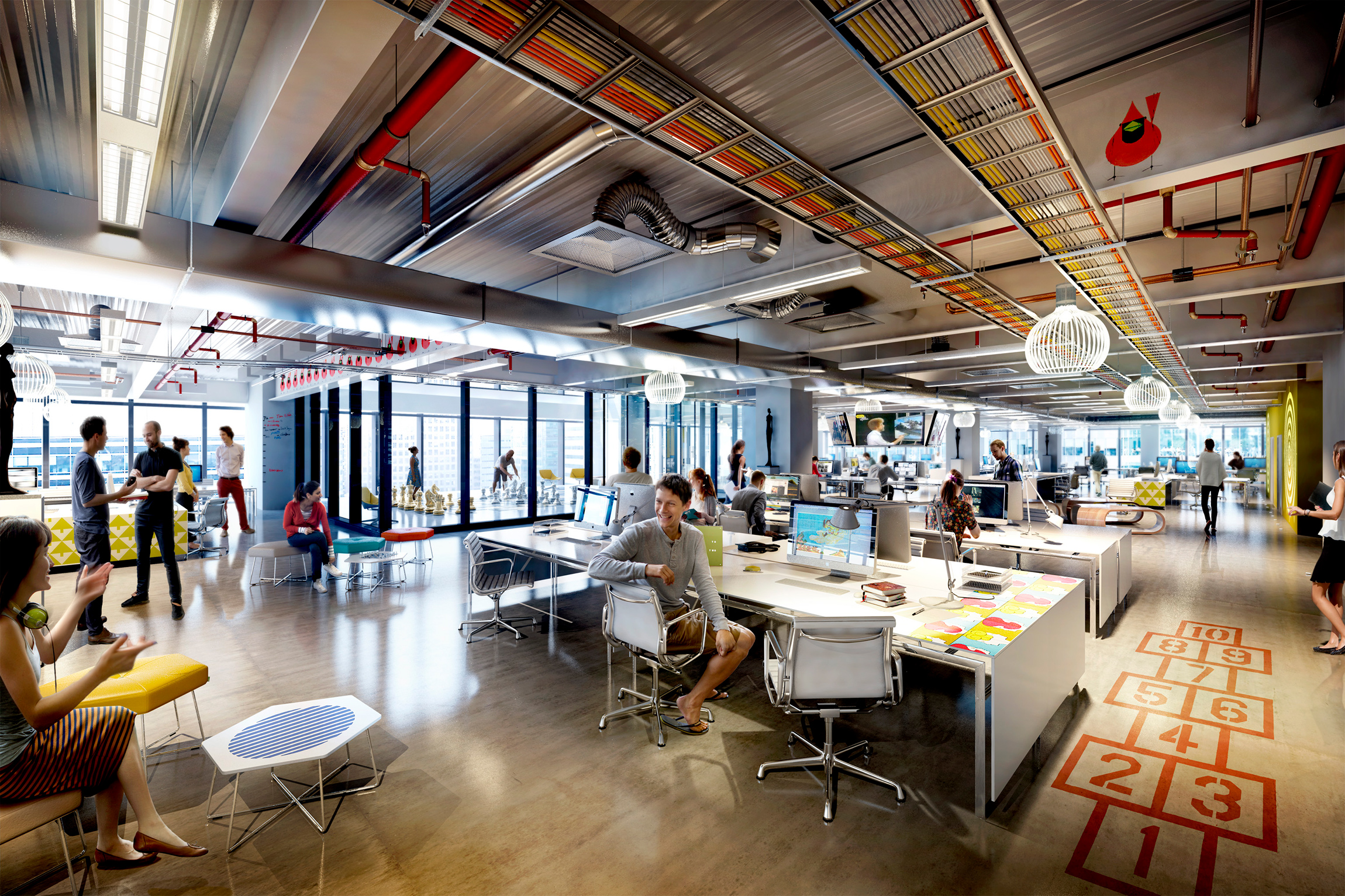
Cityscape Digital, Nikos's former company, demonstrates a profound understanding and application of these techniques, creating a deep impact on the viewer’s gaze and mind, successfully capturing their attention.


Cityscape Digital’s Play of Light in their Creations
In an image created by Cityscape Digital in response to a client's brief, they showcased a London building which focused on highlighting key areas. The final image was a staggering display of light usage to capture the viewer’s attention in a flash. It shows an extremely brightly lit building entrance, automatically directing the viewers' gaze towards itself. The beaming entrance stands out as the brightest point in the composition, establishing it as the primary focal point. Furthermore, a secondary focal point is created, prompting the eyes to explore the entire image and perceive its spatial depth.
Another project demonstrates the effective use of tonal contrast, alternating between dark and light shades, to stimulate visual progression. The image showcases a building standing predominantly in the shade alongside a street buzzing with pedestrians. Only a portion of the building is illuminated by sunlight. Upon observing the image, the initial focal point that captures the viewer’s attention is the signage of the building labelled "the monument building”. This leads the viewer's gaze to extend towards the surrounding areas of the composition, where a lady wearing a red skirt can be seen entering the shaded part of the building. Visuals of people on the street create a hierarchical sequence of movements, guiding the viewer's exploration of the composition.
Talking about colour contrast, blue and orange colours count for an unmatched combination to depict the principle. In an image by Cityscape Digital, the amazing snapshot of a twilight sky from the movie Grand Budapest Hotel exemplifies the same. The dominant hue in the image is blue, while the sun is not visible in the composition. The viewer’s eyes directly strike the entrance of the building, bathed in orange, which represents the reflection of the sunset. To emphasise the colour effect, a scene is crafted where a lady is shown crossing the pavement in front of the entrance, followed by a taxi with illuminated lights shining on the pavement and the lady. This deliberate arrangement creates a movement guided by the orange colour, concentrating viewers' focus on that particular area. Additionally, another moment is created by skillfully combining the storytelling power of light and colour, striking a balance with the blue sky colour. Furthermore, throughout the image, there are additional elements such as another woman where the contrast between dark and light is evident, attracting the viewer’s eyes towards that spot. However, the primary focal point, the hierarchy, initiates from the central entry point. The more we look around the image, the more intricate details become apparent, creating an engaging experience for the viewer.


The key to the technique is to begin with a clear understanding of the primary focal point, allowing it to command attention. Then, one can progress to the second and third messages, building a hierarchy of visual impact, all while leveraging the effective use of colour contrast.
The principle of highly saturated colours is explained in the next image in the presentation. Nikos shows a building which signifies the brand of the client in red, blue and white colour. A bright skylight sets the scene for a well-lit space. To create a contrasting effect within the scene, the use of red colour near the staircase and blue colour in the carpet can be observed. These contrasting colours are visible within the interior spaces of the building, which can be seen through the transparent glass structure.
When talking about visual composition guiding the viewer's gaze, setting elements in a space is important to achieve a visually appealing and balanced creation. Various composition rules are explained by Nikos that help an artist to achieve the same.


Composition Guides
The first rule for composition guides is the rule of thirds. According to the rule, it is recommended to divide an image into a grid of equal sections, typically using a symmetrical 3x3 grid. This is accomplished by incorporating two horizontal and two vertical lines, which form the grid. By positioning the subject at the intersection points of these lines, a visually balanced composition can be achieved. In a particular scene from the movie Drive, the director applies this principle in conjunction with the brightness principle, likely to enhance the visual impact of the shot.
An additional illustration showcasing the application of the rule can be found in the interior image of the WeWork building in New York. By aligning key elements along the intersecting points, a captivating visual composition is achieved. In the particular image shown by Nikos, a sleek linear sofa is positioned along the horizontal line, while complementary elements like paintings and distinctive lighting fixtures contribute to the overall aesthetic. Nikos describes how he was thinking about the story while composing the image and not creating a story out of the image.
“When crafting and visualising a space, it is important to always keep the narrative in mind, forming a mental image that captures the essence of the story.”
Nikos Nikolopoulos
Another rule similar to the rule of thirds is the Golden Ratio rule. Both the rules have one particular distinction between them: the grid employed is asymmetrical and the spacing of the central lines is narrower. However, the underlying principle remains consistent, emphasising the placement of the subject at the intersection points to create a visually compelling composition.
The Golden Triangle rule employs a technique where an image is divided into triangles by utilising a large line that extends across the image, resembling the diagonal of a rectangle or a square. When we connect the other corners of the image perpendicularly to the mainline at 90 degrees, a story is created along the main line and the intersection points of the three lines.
The most intriguing rule is the Golden Spiral Rule. It starts from one-quarter of an image and draws your eye entirely into a mass at either side of the image. The terminating spot of the spiral is the focal point and this is where the hierarchy begins in the image. Along the spiral, the intersection points serve as moments in the visual, completing the composition.
During the presentation, Nikos demonstrated multiple examples, effectively illustrating the above principles. These fundamentals can be encapsulated in a single snapshot: dividing the image into grids using straight lines or spirals, and strategically positioning the subjects at the intersection points of these lines. This approach emphasises the creation of a hierarchy by highlighting focal points within the composition.
In any visual composition, be it a piece of cinema, building, or a photograph, experimenting with the focal length, depth of field and focus point is essential. During different compositions or images, we need to reset our minds and rethink the visuals from scratch, considering the parameters of the story we want to convey.
The process of creating a great composition emphasises the importance of conceiving the image in our minds and then seeking references to develop the ideas further. Creating mood boards, incorporating references from sources and drawing inspiration from real-life lighting situations or specific frames are the parts that lead to crafting a great creation.
Every composition serves the purpose of storytelling through design. The ability to skilfully integrate design principles is crucial in creating a successful and compelling narrative. A designer who can effectively combine these principles will excel in conveying their message and selling the design.